Spot Architecture - Granite Cathedrals
Words by Michael Barker
In the opening scene of Bobby Dekeyser’s “Grand Prairie” part, he enters the frame pushing at full speed through an expansive granite plaza with an array of dark office towers looming in the background. There’s a full 5 seconds of buildup before Bobby even snaps his tail for the first trick, while Anna von Hausswolff’s ethereal organ music sets a foreboding tone that compliments the visual image of the towers beyond.
The setting is Toronto Dominion Centre (TD), an austere complex of 6 modern office towers located in the heart of Toronto’s financial district. The whole part clocks in at 2 minutes, of which 26 seconds is set at TD. This is a mere blip compared to the recent spate of full parts dedicated to particular spots-- e.g. Silas Baxter-Neal’s part at Lawrence Halprin’s Lovejoy Fountain in Portland. In this case, the towers are a recurring theme, bookending the part and acting as a center of gravity within the composition. It’s a pure synthesis of skateboarding, architectural scene-setting, and deliberate editing. The gravity of the part was summed up well in the podcast, Mostly Skateboarding, in which the feeling of watching Bobby’s opening line at Toronto’s TD Centre was compared to entering a “cathedral”.
The portion of TD Centre you are likely familiar with
Granite Cathedrals
To anyone who’s not a skateboarder, the idea of an austere downtown office plaza even slightly resembling a “cathedral” may sound ridiculous. But in the case of TD Centre, it’s the precise description that its original architect, Mies van der Rohe, would have hoped for. TD may look like countless other mid-century urban plazas out there- a cold, stark shrine to business and capital- which is true, but that’s only part of the story.
For skateboarders, TD’s plaza, and others designed by Mies throughout North America between the 1950’s and 1970’s, formed the blueprint for many of the world’s most treasured skate spots. These plazas offer skateboarders a highly desirable combination of smooth surfaces, linear and repetitive granite benches, and scenic urban backdrops. Building security and passing crowds create a sense of unpredictability that only contributes to their allure.
Flatground is abundant at TD Centre
For Mr. Van der Rohe and his industrialist clients, the austere glass and steel towers of TD Centre were the modern equivalents of classic Greek temples and gothic cathedrals. It was the post-war era, a time of unprecedented optimism towards technological innovation that completely changed the planning and architecture of cities throughout the world. Business was religion and the grey-suited men who occupied these new cathedrals of capital were clergy. TD Centre was Mies’ crowning achievement in this regard. It is the largest of his office complexes and was one of his final commissions, completed in 1974 just 5 years after his death. Like many of Mies’ designs, TD has not changed much since it was built, a testament to its success and historical significance. In 2003, it was designated as a historic site and the plaza was renamed after the Canadian jazz musician Oscar Petersen.
In both architecture and skateboarding, these monuments to modern progress are sacred sites, but their existence is no accident. To better understand their origins and influence, we’ll first look back to New York City in the 1960’s.
Mies and the Origins of the Corporate Plaza
Mies van der Rohe and the Seagram Building
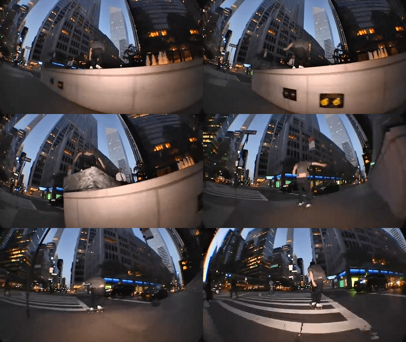
The modern office plaza is a distinctly North American phenomenon, an intentional product of New York City’s 1961 POPS program (an acronym for “privately owned public space”). This is also known as “incentive zoning”, which encourages private developers to build public spaces in exchange for additional floor area allowances in high-rise developments. As a result, they could build more and increase their profits, and the general public could reap the benefits of new pseudo-public space. This pivotal piece of legislation was largely inspired by the success of Mies’ design for the Seagram Building on Park and East 57th in NYC, completed in 1958. Seagram’s plaza, aside from hosting some of the more notable noseblunts in NYC skating history, is a renowned public space success story; so much so that it inspired William Whyte’s 1980 book and film “The Social Life of Small Urban Spaces”, where it was cast as an ideal example of a bustling, humanistic, and democratic space.
Mies’s design for Seagram was in part a reaction against the common skyscraper design of the time, which stepped back from the street at its upper levels creating a “wedding cake” or “ziggurat” form --e.g.. NYC’s Woolworth, Empire State, or Rockefeller Center buildings. These were a result of NYC zoning regulations intended to reduce density and allow daylight to reach street level. In contrast to this, Mies instead set the entire building back 100 feet from the street, creating a massive pedestrian plaza flanked by fountains. This allowed the tower form to be a pure monolithic extrusion, which was much more in line with his design philosophy. While this has become common practice today, at that time it was a novel approach. Prior to Seagram, large public plazas tended to be publicly financed and related to public projects (e.g. Brooklyn Borough Hall, LOVE, Pulaski, or Milano Centrale). Seagram and the POPS program created a new type of space in urban centers that had a profound impact on the evolution of skateboarding.
Less is More
Mies is famously known for the phrase, “less is more,” a declaration of the virtues of functionalism, minimalism, and mass-production. The phrase has obvious values when applied to design: a reduction to basic identifiable elements, simple things done well, and expressing essential or inherent material qualities. There are also some clear parallels with skateboarding: the timelessness of a Huf ollie, or the simple pleasure of watching Ray Barbee cruise down a sidewalk.
Mies’ Barcelona Chair
Even if this is the first time you are hearing of the name “Mies van der Rohe”, you’ve likely sat in a chair designed by him, or at least a knockoff of one, in an office, waiting room, or gallery. He was the final director of the Bauhaus art and design school in Germany before it was shut down by the Nazis, forcing most of its leading artists and designers such as Anni and Josef Albers, Walter Gropius, Wassily Kandinsky, Paul Klee, and Mies to flee to more welcoming countries such as the US or France.
These emigrants went on to influence the disciplines of art and design to the point that now, culturally speaking, it’s the air we breathe. Mies and Gropius forever changed the way our built environments are designed, while Klee, Kandinski, and Albers changed the way we experience color and composition in the images that we consume daily. In skate graphics, the Bauhaus influence can be found in the Klee and Kandinsky- inspired graphics of Don Pendleton, Joe Castrucci, or Soy Panday; or in the ubiquitous Supreme box logo, which uses Futura, a font originally designed in Germany in 1927.
The architectural style that developed out of this era eventually came to be known as the “International Style”, of which Mies was one of the most influential architects, though his success and influence cannot be attributed to him alone. In fact, there would be no “Mies” without two important women: Lilly Reich, his partner in his early years with whom he co-designed both the iconic Barcelona Chair and Barcelona Pavilion; and Phyllis Lambert, the wealthy Canadian philanthropist and architect who oversaw many of his corporate commissions, including TD Centre and Seagram.
Despite Mies’ tendencies towards austere minimalism, his designs were incredibly technical, channeling recent innovations in steel and glass construction. He earned a reputation as a stubborn perfectionist who considered even the most minute details, even to a fault. Seagram’s window shades were designed to only stop at aesthetically acceptable positions, and he once insisted that users “must learn to love” his uncomfortable early furniture designs. At TD, this obsession with details included custom light switch and ashtray designs, as well as the specification of yellow daisies that still populate the lobbies and plaza today.
from “BOB”, 2020
This marriage of technical innovation and minimalism can seem like a contradiction, given that “technical” skateboarding tends to refer to flip-in/ flip-out tricks, which at times can seem extravagant. This contrasts with a more “Miesian” definition of technical, which is more about handling complexity with precision and intentionality, as in the yellow daisies at TD. In skateboarding, this boils down to the elements of style: speed, precision, gear, arm movements and hand gestures. Bobby Dekeyser’s enders in both “Grand Prairie” and his 2020 part “BOB” (where a black and white aerial of TD Centre also makes a B-roll appearance) demonstrate these very qualities of making complex maneuvers look simple, even mechanical. Or take Marc Johnson’s signature laid-back roll-away. It’s clearly not an accident, and if it were any more exaggerated it may even be considered “fake”. Yet MJ is precise enough in his execution of it that although it’s intentional, it also looks completely natural.
Mies’ Lasting Influence
Mies’ office building designs––when looked at side-by-side––are varied compositions of the same basic elements to fit different sites. Each subsequent project riffed on the last as a refinement of the same basic principles. In musical terms, it’s reminiscent of Spiritualized-front man Jason Pierce’s musing that “I’ve been writing the same song all my life.”
TD Centre under construction
The Miesian DNA went on to influence generations of architects to come and, by extension, the designs of some of skateboarding's most important spots. Aside from TD Centre and Seagram, Mies also designed Chicago’s Federal Center and IBM Plaza. As head of the Illinois Institute of Technology in the late 1930’s, Mies influenced hundreds of young architects, including the prolific Skidmore, Owings, and Merrill (SOM), who designed NYC’s Solow Building, Paine Weber, and One Chase Manhattan Plaza, as well as LA’s JKWON and SF’s Alcoa Building, which sits atop the elevated plaza connecting to the recently demolished Hubba Hideout. Philly’s Muni building was designed by Vincent Kling, an SOM alumnus. Chicago’s Chase Center was designed by C.F. Murphy, who previously worked with Mies at Daley Center. AC Martin, who designed LA’s DWP (IMO one of the few important pieces of architecture in LA that isn’t a house) and its famed ARCO plaza and rails, also began in Chicago under Mies’ guidance.
All Tomorrow’s Plazas
Despite the austere appearance of plazas like TD Centre and Seagram, they are treasured by both skateboarders and the general public alike, which is a rare accomplishment. Many of the imitations that popped up in North American cities in the following years may have been skateable, but they were far from successful as public spaces, and many have been demolished or renovated since (RIP Hubba Hideout). In some cases, it was massive parking requirements that lifted so-called public spaces far above street level, disconnecting them from public access, e.g. most of downtown Los Angeles. In other instances, these spaces became littered with spikes, unmaintained landscaping, uncomfortable seating, and other “defensive” architecture intended to deter pretty much any living creature.
Architecture of a more contemporary type at Hudson Yards
Nowadays, developers are more mindful of the value of successful public spaces. Unfortunately, they have also gotten better at designing skateboarding and other undesirable activities out of them. This can be seen in NYC’s recently built Hudson Yards, an overly commercialized architectural petting zoo atop an unimaginative and one-dimensional public space. It’s a transitory space that one may pass through on the way to buy a fancy watch, but it’s not a place to sit, pass time, or people watch. Or take Domino Park in Brooklyn as another example, which is a commercially successful waterfront park but lacks the “spontaneity inherent to non-programmed spaces”. In other words, people enjoy the space, spend money there, and go to events, but the spaces themselves lack the civic character of “un-programmed” public plazas such as TD Centre and Seagram, which act more as an extension of the street. With their relentless grid of granite, grass, and benches, they aren't designed for a single pre-determined use. They’re accessible, flexible, and ultimately more democratic.
Dick Rizzo, Ollie at the Seagram Buliding
The era in which TD, Seagram, and similar plazas were constructed can be considered a “goldilocks” moment in modern history, where the design of successful public spaces did not preclude the eventuality of skateboarding. The question now is, “What will become of these spaces in the future?” At TD and Seagram, a serendipitous combination of historic preservation, some security to keep skateboarders on our toes, and some unfortunate but minor skate-stopping (the beveled cuts in TD’s ledges) likely will provide stasis for years to come. But what about the hundreds of other plazas out there that aren’t historically important outside of skateboarding? No matter how much more accepted skateboarding gets post-Olympics, these corporate-owned plazas won’t become skateparks, nor should they. Yet it would be tragic to see them disappear while skateboarding is increasingly relegated to faux-plazas and other “acceptable” spaces. Success stories like the preservation of Southbank’s undercroft, while monumental, will be difficult to replicate under market-driven conditions. Or perhaps a cultural shift is necessary, such as the one currently underway in Bordeaux thanks to the work of Leo Valls, or Malmö, where skateboarders such as Gustav Eden hold governmental positions and skateboarding is actively encouraged in public spaces.
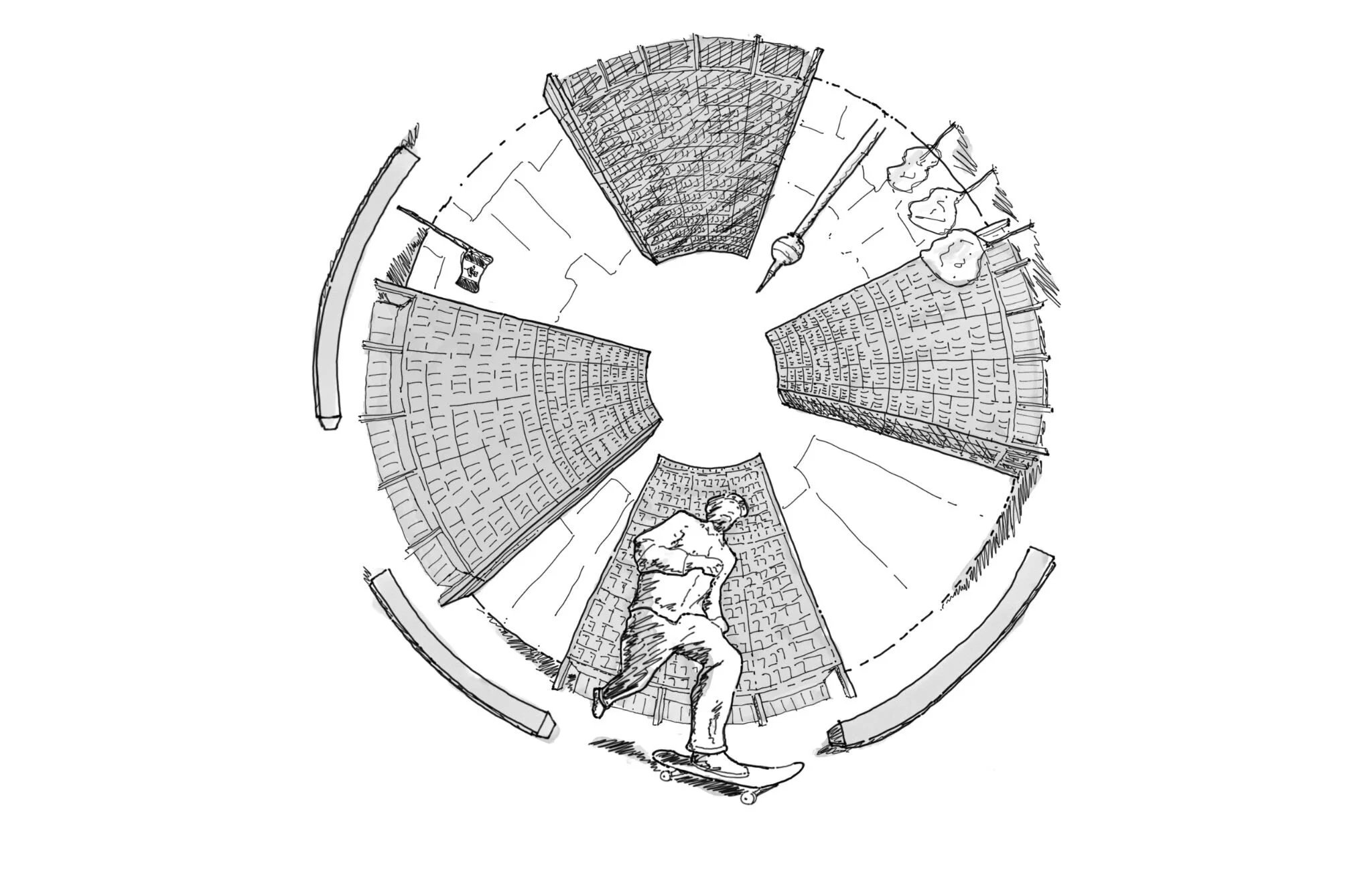
There’s a unique pleasure in getting a good, even if brief, skate session at one of these “granite cathedrals”, surrounded by people in suits in towers above, hunched over their workstations while daydreaming of a few leisurely hours in the sun. In the philosopher Jeremy Bentham’s Panopticon, the conceptual prison representing the ultimate architecture of control, there’s a central watchtower to observe prisoners inside their perimeter cells. Plazas like TD invert this, where the perimeter of office towers are the cells, and in the center lies an indeterminate open space where skateboarders find joy. Aside from the sweet rumble, crisp pop, and forgiving smoothness of its granite surfaces, these plazas offer an irreplicable feeling of freedom amidst the confines of everyday life.


