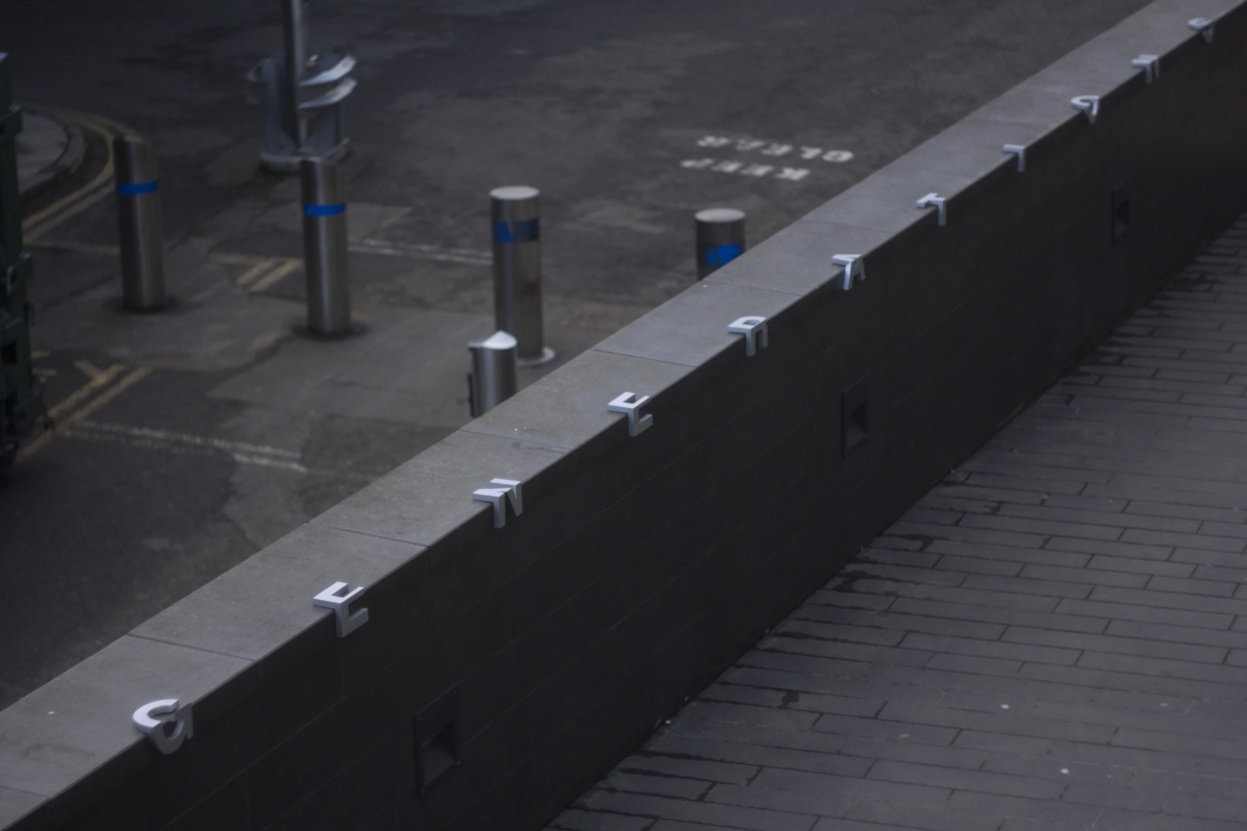
You Can't Skate Here, You Can't Sit Here
Chances are, the public places you find skateboarders are often the same public places you can goof off with your friends and have a beer out in the open. Similarly, the public places skaters tend to avoid are the same places you'll be unwillingly recorded on video or asked to leave if you're doing anything of the ordinary.
The work of Seb Price speaks to this larger issue of public space and how 'public' it actually is in our current age, an age when there are benches made specifically to prevent people from sleeping and skating on them. VP correspondent Daryl Mersom tracked down Mr. Price to talk about his work.
Where did the idea for your prohibitive chairs come from?
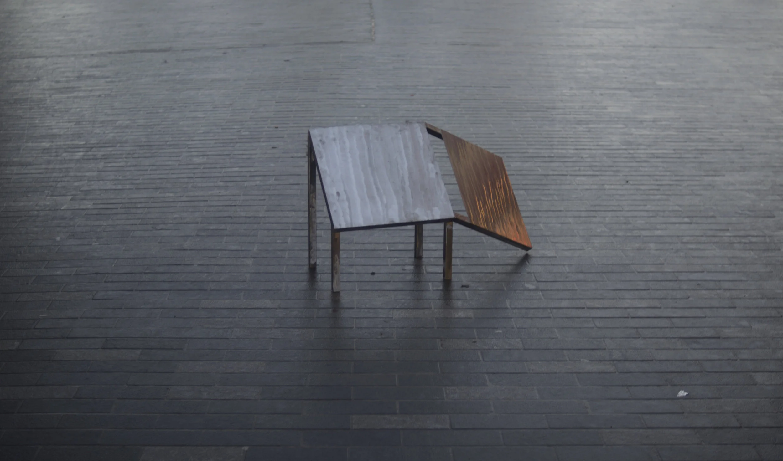
I was looking at the way in which public spaces are becoming more and more hostile and unpleasant for the people that are supposed to be using and enjoying them.
I had been looking more broadly at defensive architecture in public spaces, and how through the pursuit of manipulating and controlling certain behaviors, the designs of spaces and objects that should inherently be built for humans, are in-fact doing the opposite.
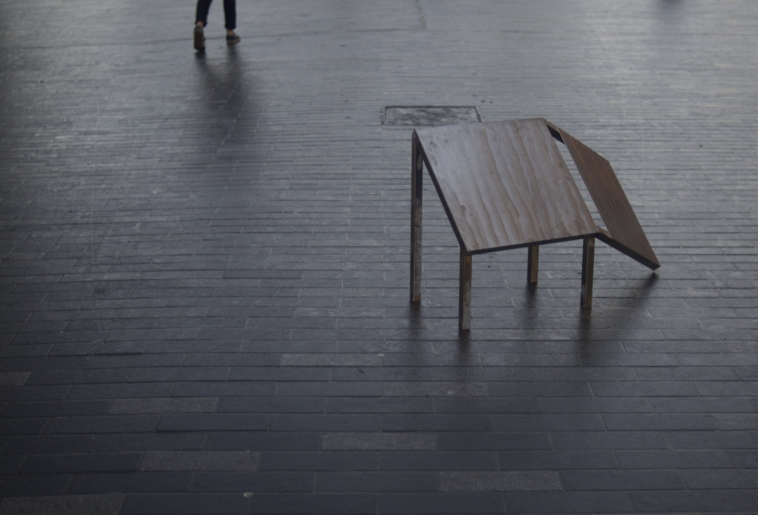
So looking in particular at the ergonomics of a chair, I abstracted them out of functional use to make a statement on how I feel public spaces are being abstracted out of functional or free use.
This chair is meant to be one of a series of 5 chairs that in various ways have had their ergonomics completely messed up like a toddler typing numbers into a CAD file, I wanted one to be 10ft tall so no one could reach it, and one to be extremely wide.
How did you research the chairs?
I based the distortions off of basic ergonomic measurements such as the height of the back and leg, and the material choice is a cold and angular metal which is purposefully uncomfortable. For the research on the subject, I used Gordan Savičić and Selena Savic’s book Unpleasant Design.
How did your skate stopper font inform this new work?
I think the typeface just opened my eyes to the problem even more, and also made me realise just how little people seemed to care, which seemed to make it a worthy cause. Among people who cared it also seemed like art/design in this area was needed.
Would you speak a little bit about the practical side of making the skate stopper font and prohibitive chairs?
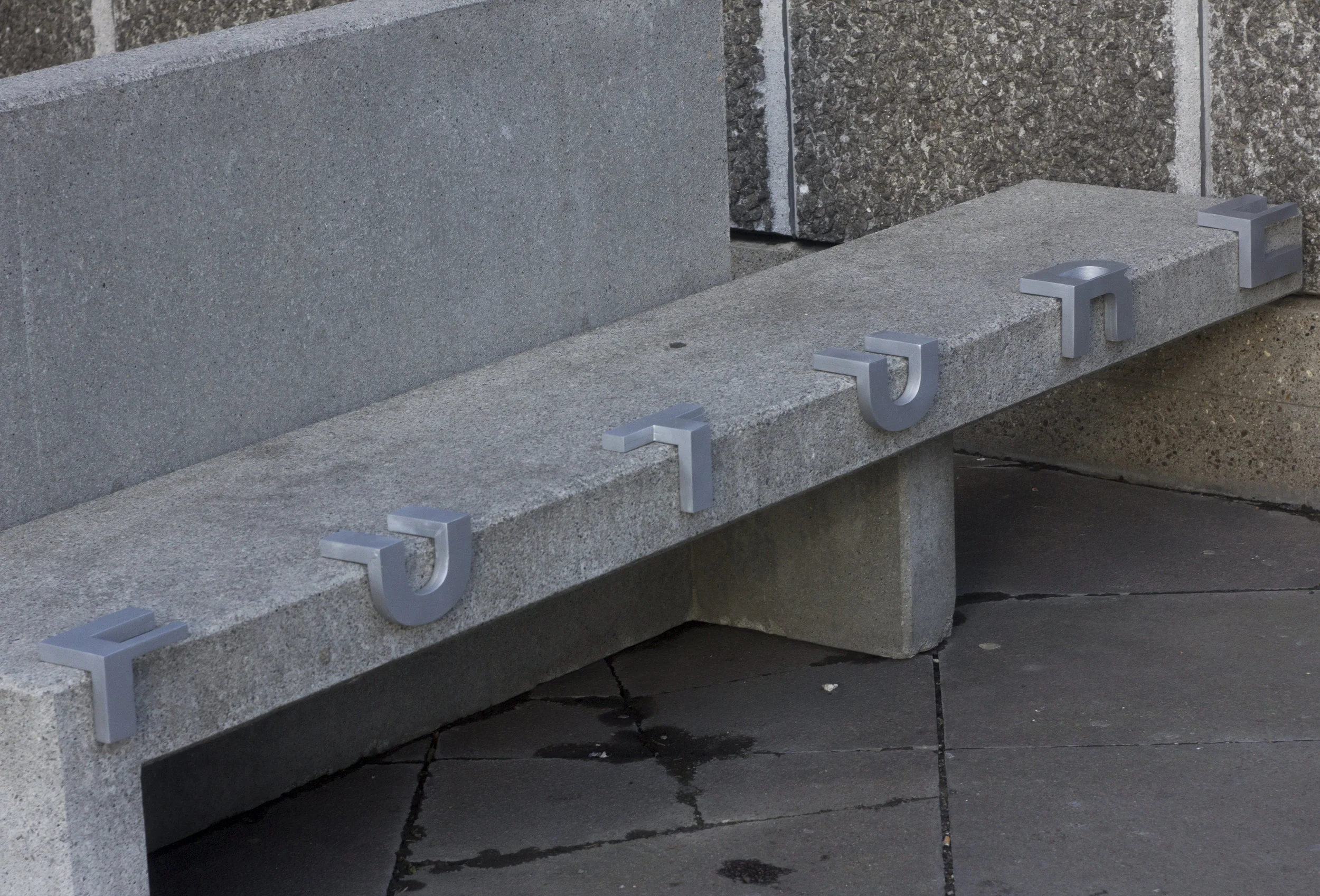
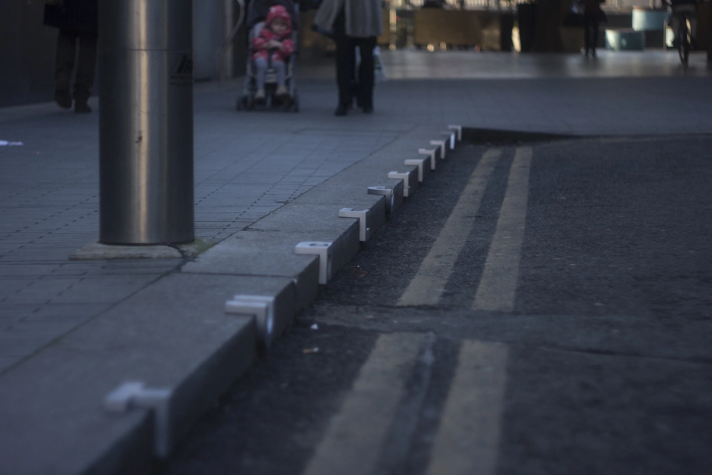
For the skatestopper typeface I ended up making the letters out of MDF (medium density fiberboard), I wanted to cast the letters in metal (I definitely would if I could afford to) but this would have cost £30 for each letter, so that was very much out of my reach. I made the letters using a CNC router, cut them in half and chamfered the letters by 45 degrees on each of the new surfaces, then re-joined them to create the folded lettering.
There were many considerations made into how the fold in the type would conflict or even add to the shape of the letter, and how legible these letters would be once folded.
The chair was created by abstracting regular ergonomic properties, such as the leg height, the angle of the back, and choosing uncomfortable materials to imitate and reflect the defensive architecture I was making a comment on.
What other people are working in this area?
I don’t really know, other than Gordan Savičić and Selena Savić, who also have a load of artists on their website - I haven’t really seen much else. I think it’s definitely something that will evolve in the public’s consciousness as it shifts from affecting just skateboarders and the homeless, to every-day people going about their ordinary activities.
How have your friends and tutors reacted to your work? Were they aware of defensive architecture before you introduced them to it?
Surprisingly none of them were aware of the skate stoppers I imitated in my last project. It seems that defensive architecture, even as it becomes commonplace and increasingly surrounds us, still goes under most people’s radar, which makes the problem all the more insidious. I wouldn’t go as far as saying that my work itself has changed their perspective, but I hope their awareness of the issue will alter.
People seem to enjoy it and learn from it, but I really want to make a series of these chairs and put them in the public spaces they were inspired by. I’m currently contacting councils and trying to get the ability to install this in a public space, and will see how people respond then.
How has your work informed the way you view the world?
I grew up in the countryside, and coming to London really made me realize how much I took my freedom for granted, everywhere you go you’re being watched or on someone else's property, restricted and contained, limited to a certain number of actions or activities, so that really hit me when I first came here.
Do you think you could use your work in this area for good, perhaps by designing challenging obstacles or less draconian prohibitive architecture, which like the snail skate stoppers in Hungary, do not prevent skateboarding entirely, but rather let skaters know in a light-hearted way that they should not skate here?
Definitely, aside from making a comment on the problem I find with defensive architecture, awareness is the main aim. I think that allowing people to form their own opinions on the issue is extremely important. Hopefully people will feel the same way.
I don’t see the disguising of defensive architecture as a positive thing, I think the further it integrates itself into the language of public furniture, the less we will be able to identify it and be aware of the control of behavior in public spaces.
How can art and design counteract this issue?
I think it can bring attention to these problems, and start a conversation about the misuse of public space, I think awareness is the main issue so the more we make people aware the better.
Do you think that prohibitive architecture can sometimes improves spots, for example, when they make an obstacle more challenging for skaters, but nevertheless still skateable and very fun?
I think for skaters that’s where a lot of the fun is, like the Camden Bench which is the prototypical anti-object which became a challenge to skate its odd curves and weird angles. But I don’t think it improves skate spots at all, it certainly makes them feel less accessible to less skilled skaters.
And finally, if you had unlimited resources (money, time, etc.) what projects on this theme would you love to do?
Cast all the letters in metal, because it would look and feel so much better, and they could be put outside as a permanent installation. I would create 4 more chairs (which is something I aim to do in the coming months), exaggerating these forms much further and reinforcing the concept of the current chair, I would then like to display these chairs within a public space.
