Exquisite Typography in 'Hockey X'
Here’s another look at the type of content we’re sending out in our newsletter. Remember to sign up!

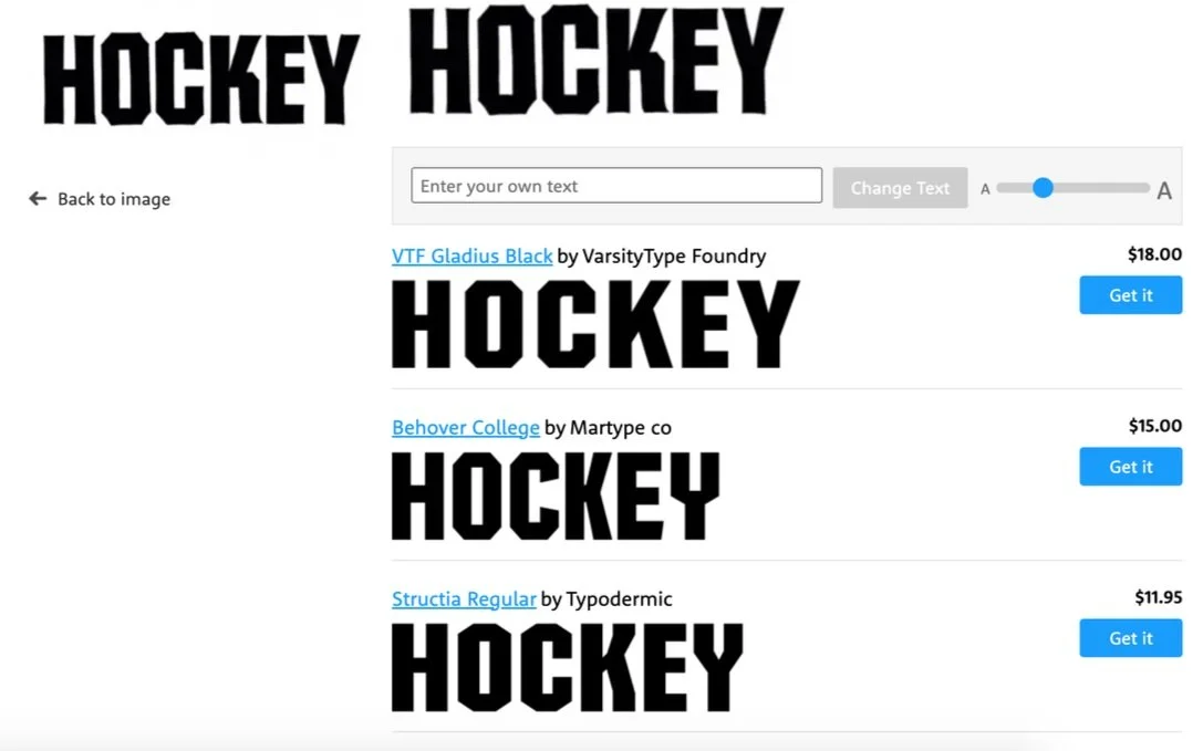
The most frequently used Hockey Skateboards logo
I often think that there aren’t that many opportunities where can combine my interests in typography and skateboarding together, although after watching Hockey’s recent video Hockey X, I’m starting to reconsider that thought. The video uses a lot of different typefaces in a manner that we’re not accustomed to seeing in a skate video (any semblance of a style guide has been ditched!), so I felt compelled to dissect it a bit.
Before we look at any examples from the video, let’s start with the Hockey logo itself. I’ve wondered about this one for a while, as it looks like a standard font with some interesting angles. Is this an off-the-shelf typeface? Or something custom? A little of both?
So close, yet….no. Not even that close.
When I look around, I can find a lot of fonts that have similar geometry, but none with these little flared serifs.
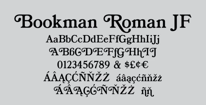
There are font sets from the 70s, specifically Bookman (see above) like we see here, that came packaged with these little extenders you could add on for some extra flavor called ‘swashes’. The font was available for purchase with and without the swashes. Although it’s not quite the same thing, there’s a similarity in that the Hockey logo was probably from an existing font and has some little flared serifs similar in principle to Bookman’s swashes added. Modifying an existing typeface to create a brand identity mark is common practice, so there’s nothing particularly Earth-shattering about this presumption. If you have other theories, send us an email.
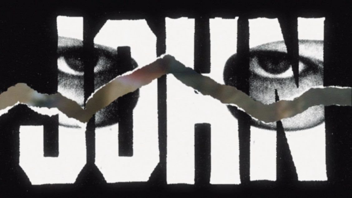
Here we have the same font used for the Hockey logo for John Fitzgerald’s intro. (PS: I love this dude’s skating :) ) Here we see a little more flavor added, we can see some texture along the edges. This sums up the level of detail this brand puts into its graphics. They’re not just slapping titles on, they’re creating truly unique graphics that look, appropriately, like the products of a complex process.

This brand is becoming known for some of the more high-effort board graphics out right now, so an execution of this sort for a video ties into the brand’s priorities in a big way.

Andrew Allen has this graphic showing before his part, this is a dope reference to a serious banger of an album - Sweetheart of the Rodeo by The Byrds.
I won’t say much about the album because we’re talking about type here, and there isn’t a song from this album in the video, but it’s sick to see this thrown out there and to me shows that Andrew Allen has great taste in music. Also, I do think it’s worth noting that this isn’t just ripped directly from the album cover, the image has been silhouetted and had it’s color changed — maybe to prevent a lawsuit, but more likely to tie it to the rest of the brand’s established aesthetic. Once again, the effort is apparent.
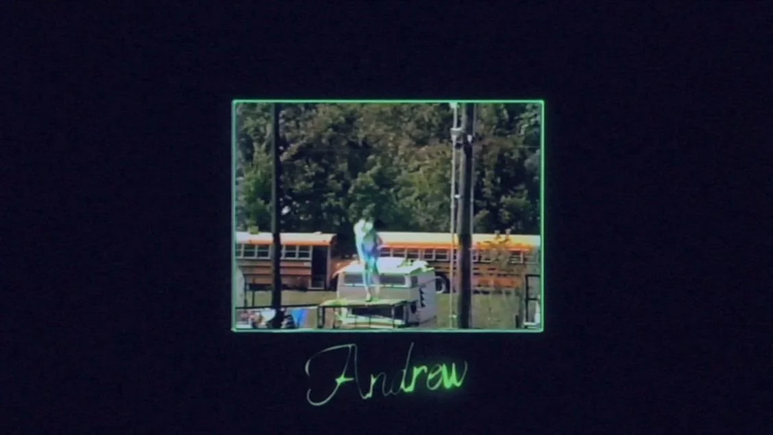
We also have this glowing script type for Andrew Allen’s intro. The type itself isn’t that interesting, I mean, it’s nice, but what really stands out here is the texture over the whole graphic, and we see it in a lot of places in this video. It’s really grainy, reminiscent of watching a VHS tape.

That’s a look also referenced in the credits, and a few other places I’ll talk about. It's interesting that the brand is being brought in this direction that has these references to VHS rental and 80s straight-to-video movies. If you’re under like..IDK 30?, this is something pretty specific but very foundational if you grew up renting movies from the video store like so many of us did.
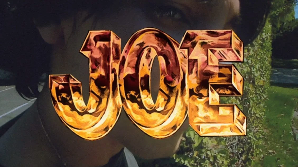
And heeeere we go! This is the graphic that I saw and thought ‘I need to talk about the typography in this video’. What the hell is going on here!?!? In a good way.
It’s dimensional, and it really pops off the screen. It’s also hand painted, or at least has a texture to it that’s reminiscent of something hand painted. The effort put into these graphics shines through in this example.
This is likely based on this font we see here, I’ve seen it called Durango or Campora, I’m not sure which is the original name but it’s a pretty recognizable font.
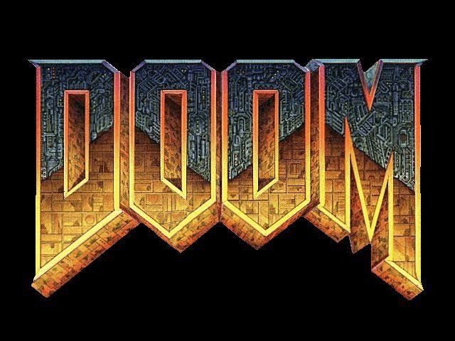
It’s been rendered to evoke hellfire or something (and reminds me of the DOOM logo). Which is spot-on for this brand.

And here we have a direct reference to a cathode ray TV, the type all of us of a certain age grew up parked in front of. Again, anyone who’s on the younger end may not get this reference, but anyone who grew up in the 80s-early 2000s sitting too close to the TV, this one’s for you, especially if you were a video store fiend like I was.
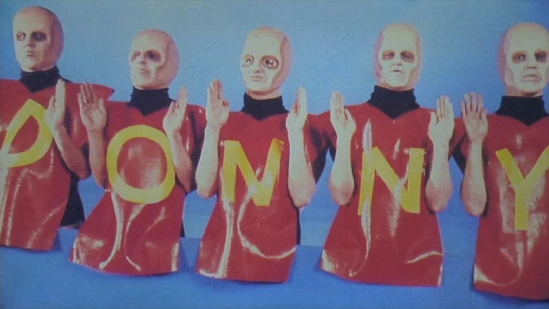
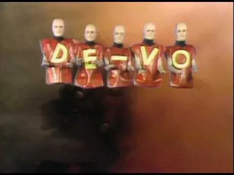
Okay, now this is a reference that’s from well before my time, so it’s definitely a washed one for Donny, but I love that this is in here.
The above is a reference to the DEVO Freedom Of Choice video, which is a really weird and creepy (in a fun way) one. God, these guys look weird.
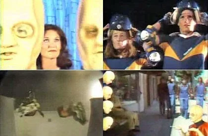
The video also features some wild early-80s skating, which was a really interesting time for everything — post-Dogtown, pre-Bones Brigade mania.

Here’s another textural heavy hitter, this one has this metallic look paired with some of the aforementioned VHS-esque fuzz.

It’s reminiscent of action movie titles from the ‘80s, the kind of titles we were surrounded by during any trip to the video store well into the ‘90s. The shapes as well as the texture, this is a less direct but still effective reference to this whole trope that’s being played with, and the VHS fuzz overlay drives the reference home.

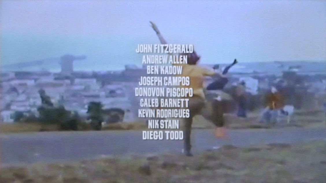
Ok, this is what I love about this video. Even the dudes who only have a trick or two have some serious effort going into their titles. They’ve broken from having a unifying system for all titles in the video.
The products of well-defined design systems can get pretty boring, so respect to that. What I really love is how much that’s being played with, how much they’re really going in and making something high-effort out of a lack of constraints.
Here we have the same type as is used in the Hockey logo (is this a sign of a design system??!?! Did I just contradict myself?!?!) , but with this shattered glass texture applied. This is actually closer to what I was talking about them NOT doing in this video, NOT just doing all the riders’ names in the same typeface as the brand logo or something like that. Seeing it like this as a one-off is a little weird, was expecting something unique. Whatever, let’s keep moving.

Nothing notable here, just wanted to point out that this guy looks like Tim Heidecker. That hit me right away.
Okay, for how fucked up good this part is, this guy needs something cooler than this.
Throw this guy’s name up in giant metallic type like they did with Caleb, because that’s what he deserves. He’s the action hero.
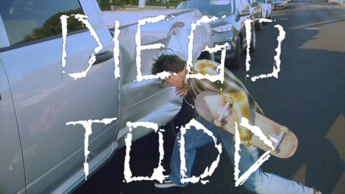
This is such an 80s movie ending! It looks like they have a font made based on the Hockey logo I called out at the beginning of the vid (design system does exist). Really curious if this is an off-the-shelf font or something that’s been altered pretty significantly for the brand.

This is literally what you see at the end of a movie, so the reference is pretty direct here.

Calling out that the website, and I never noticed this but it’s so sick, the website has the name ‘Hockey Home Video’.
This calls to mind these 80s-90s VHS tapes that were always put out by companies called something ‘Home Video’
And that’s it! Now you’ve conducted a font hunt through a skate video :)